Blab
B. Lab as a brand is dedicated to enable busy professionals across the world to achieve their beauty goals in a simple and easy way. This endeavour brought the brand to India with a renewed vision of combining their exclusive European beauty treatment with personalized service. B. Lab aimed at expanding its portfolio in the personal care category by introducing their new range of face-masks – a product that enabled beauty on the go. Our challenge was to enable the brand cut-through the existing clutter in the category and create a distinct identity for its products across varied segments.
B.LAB is India’s first company to combine exclusive European beauty treatments with personalized advice to deliver visible results quickly and safely. Whether it is on the phone, at their clinic or at an authorized salon partner, with B.LAB customers get genuine and trustworthy service. B.LAB builds pristine products with the finest bio-actives. Made by the best bio-tech companies in Europe, the bio-actives are isolated from purest natural sources.
Our key role was to launch and popularize B. Lab’s Face Masks. The approach was to win the trust of the consumers by narrating an authentic story and also demonstrating the product’s capabilities through an effective visual language. This core strategy had to be rendered to varied touch-points, we enabled the same by creating and executing Packaging, POS elements, E-Commerce pages and other collaterals.
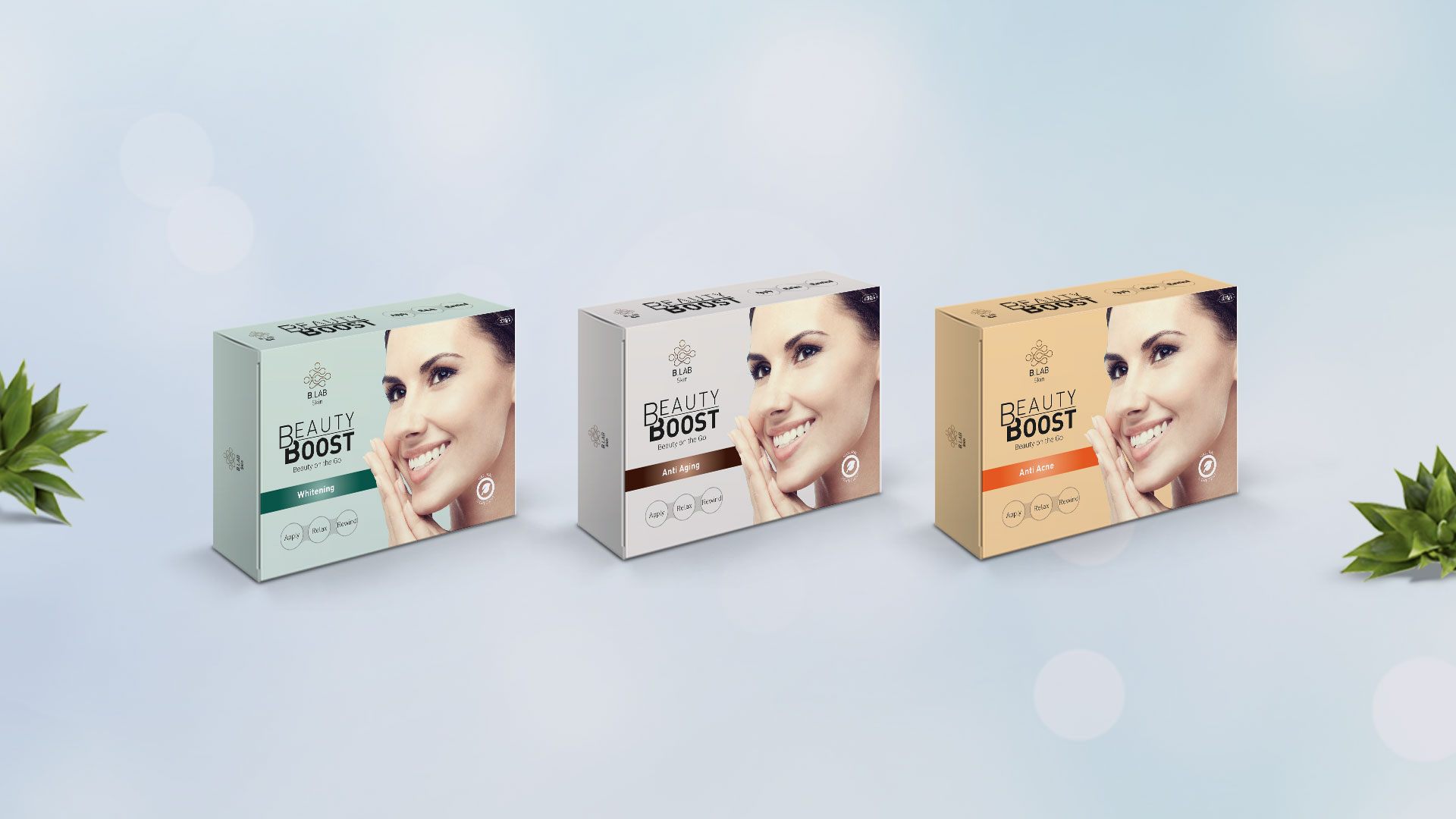
Packed to Perfection
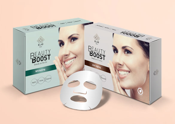
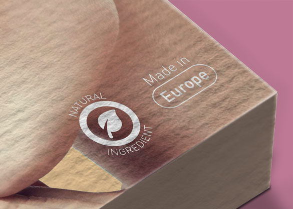
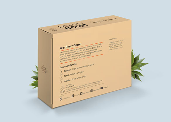

The brand was new, so was the product and our experience tells us that for masses to accept a new product as a general practice, the quintessential aspect about communication is – Simplicity. B-Lab’s Face Mask’s key proposition was its unique 20 minutes effect. All it takes is 20 minutes to feel renewed and look good. We chose this as our central narrative and coined the name – ‘Beauty Boost’. The face-masks now were a branded range. We then gave it a unique identity in the overall design grid.
The goal of the packaging was to be relatable, thus we gave it a contemporary and organic in nature look. The packaging segmented the 3 offerings of Whitening, Anti-Ageing and Acne by bringing it into a predictable system of colouring and patterns. While the hues stood out on the shelf, the bold strips served as distinction of the products offering. Product’s active substance and the natural personality was established through clean layouts and reinforced using the pure, practical and scientific character that permeated through the brand’s image.

Keeping in mind the time crunched audience we were talking to, we knew we had to visually communicate the ease of using BeautyBoost. A visual infographic was created to put across the 3 easy steps of Apply. Relax. Glow. This information system was adapted for varied product offerings but the 3 step simple ritual was carried forth for all products.
Easing the E-Commerce
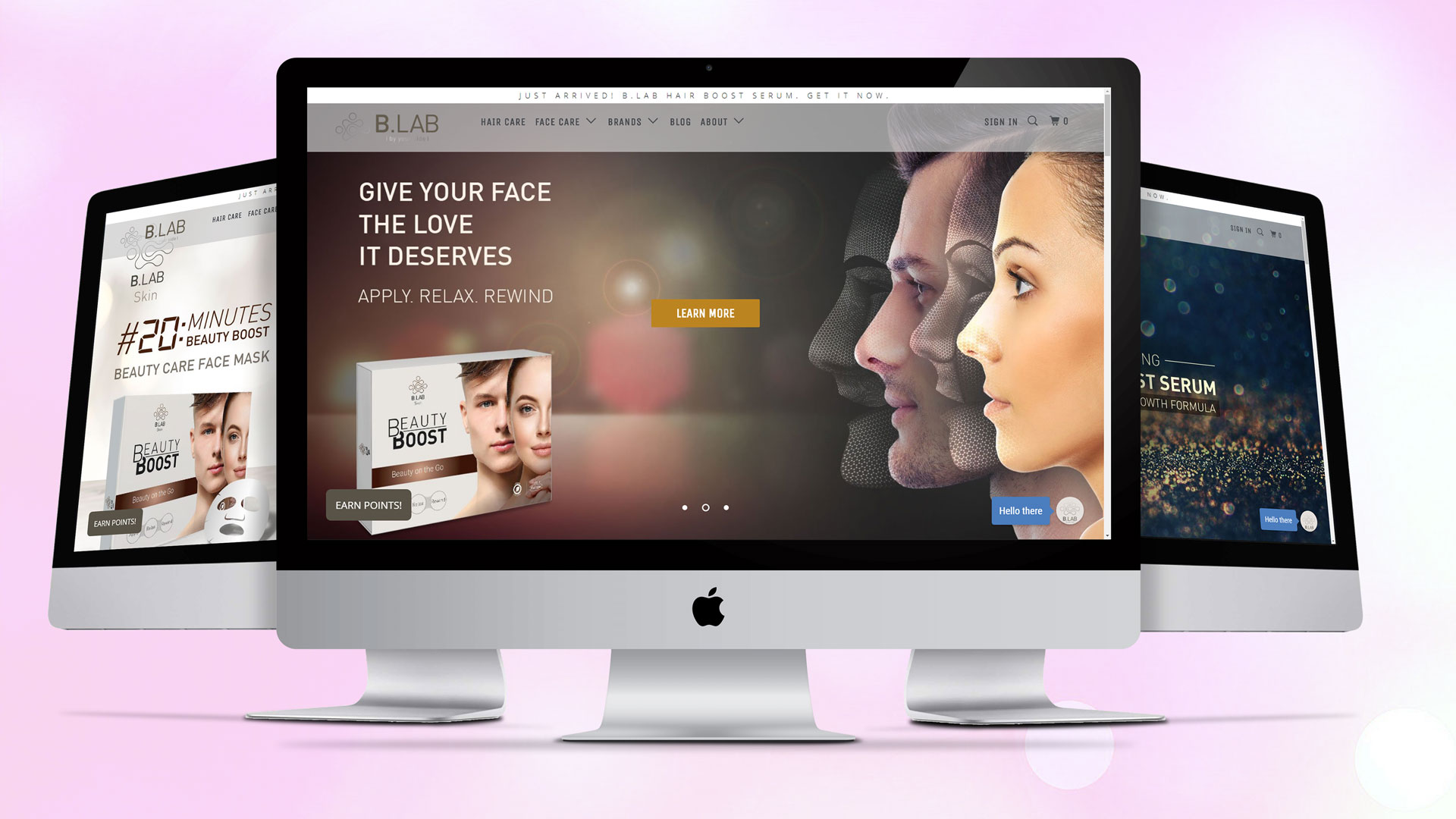
Being an international brand their web-presence was the most crucial element it had to be an e-commerce space that encouraged the users to engage in a transaction. We designed and delivered the entire e-commerce platform for B-Lab. We managed the end-to-end process right from the design of the portal, landing pages, lead banners, content and info-graphics.
The key was to render the physical aspect of the brand B-Lab, it being modern, global, for the busy professionals, sophisticated to the web experience. We seamlessly translated the brands elements and promises in an engaging e-commerce experience. The design is simple yet suave. The white background and simple imaging makes it a soothing experience. The navigation is easy and uncomplicated.
We drove traffic to the portal by a highly effective social media, email and search marketing campaign.
Social Boost
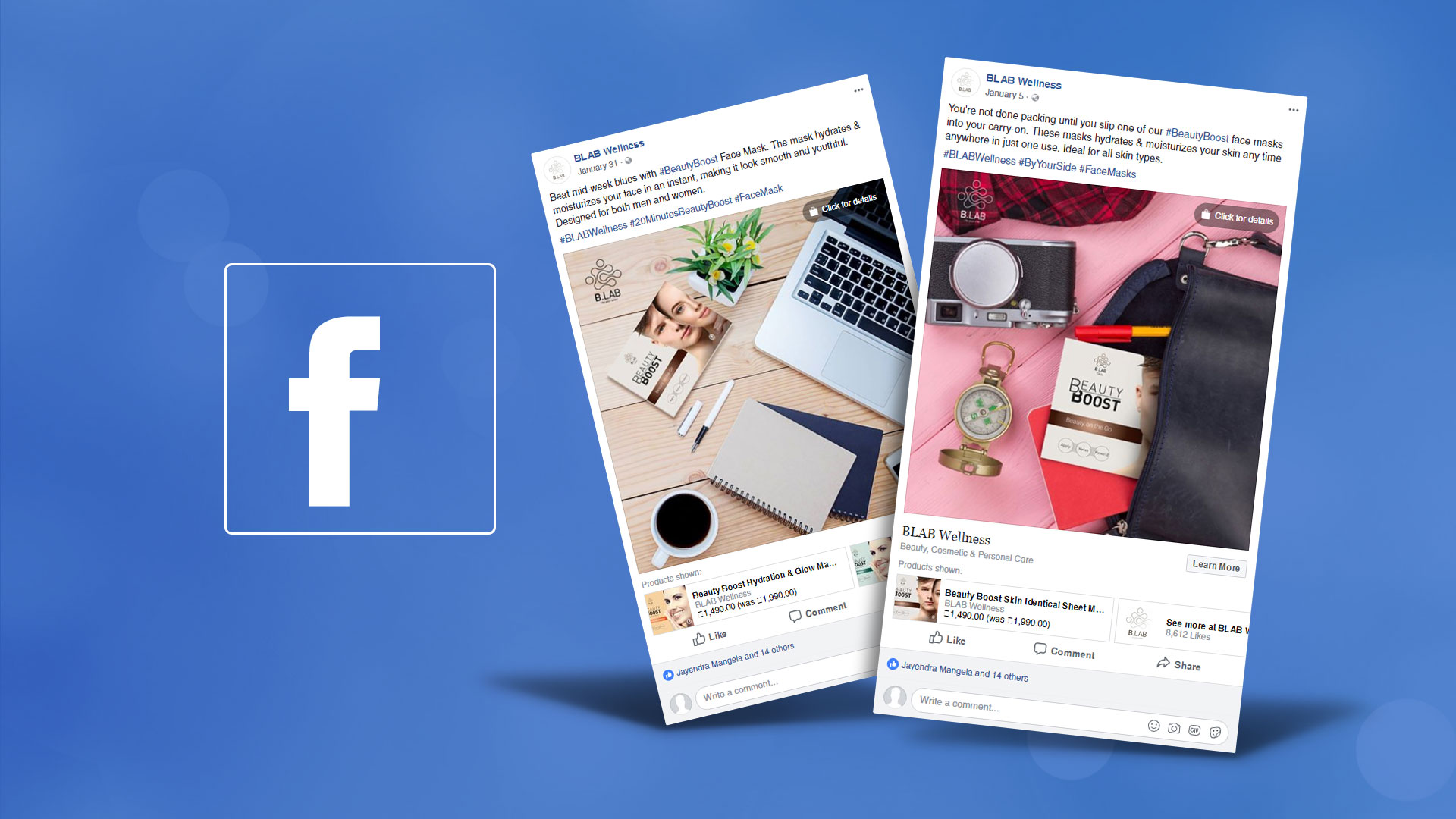
We also launched an intensive social media campaign across Facebook & Instagram. The content strategy was weaved around our information dispelling architecture. The key information pillars being, visible results and instant benefits. We adopted the same visually direct, minimalistic creatives. The product’s usage, benefits and the problems it tackles were designed and translated into intriguing posts that helped create the needed awareness and engagement. It earned us click-through to the website.
The social media campaign was supported by email and search marketing initiatives. This strengthened the overall digital drive.
Sophistication through Signage

Fuelling the physical presence of the brand, we designed and executed exclusive point of sale materials. They were executed across professional salons and beauty retail outlets. This helped the brand and its offerings stand out at touch-points that encourage visibility.


